Work
Contact
LinkedIn
Work
Contact
LinkedIn
Daniel Lebost's Portfolio
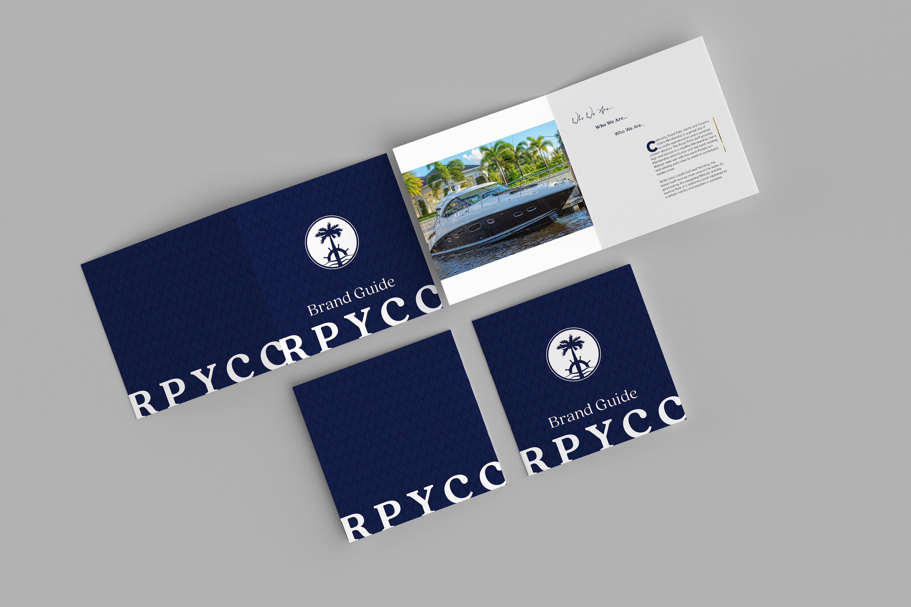
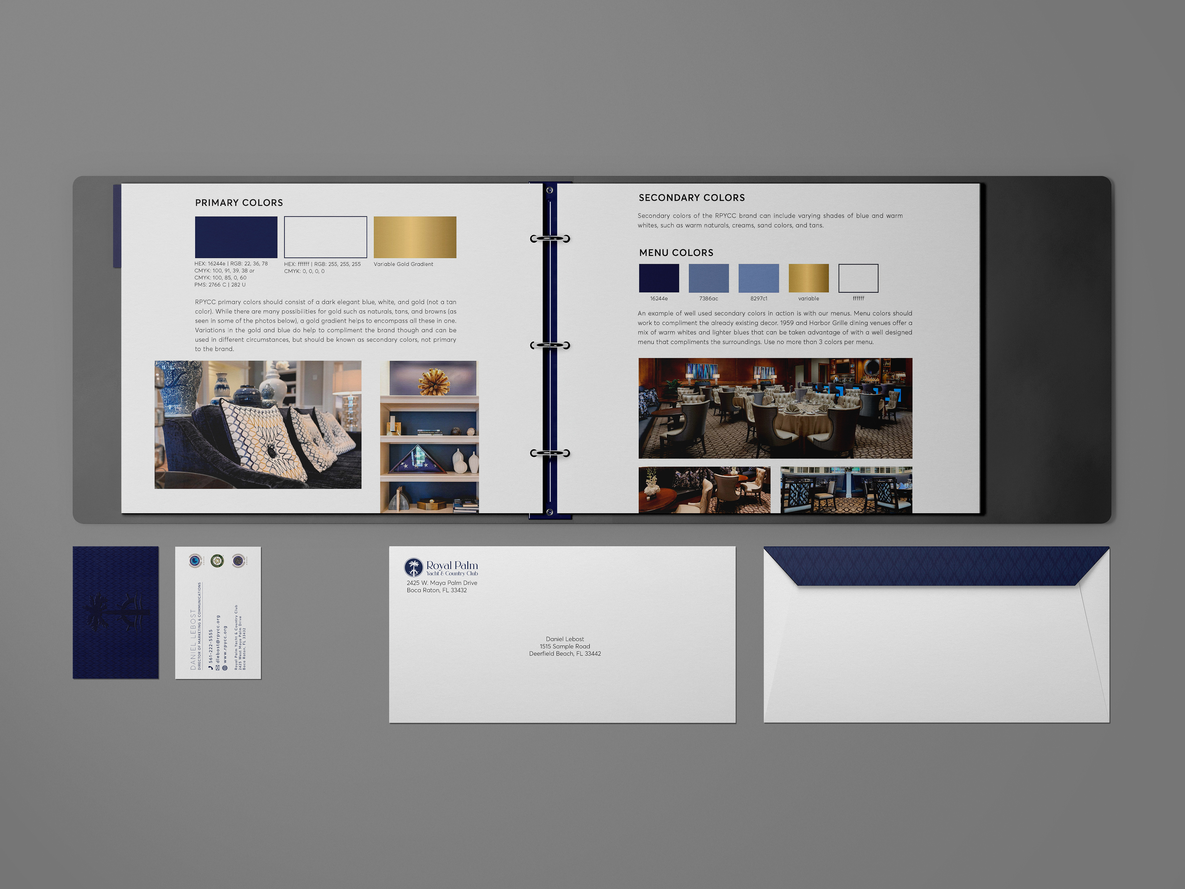
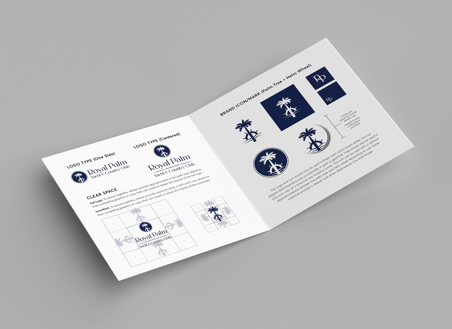
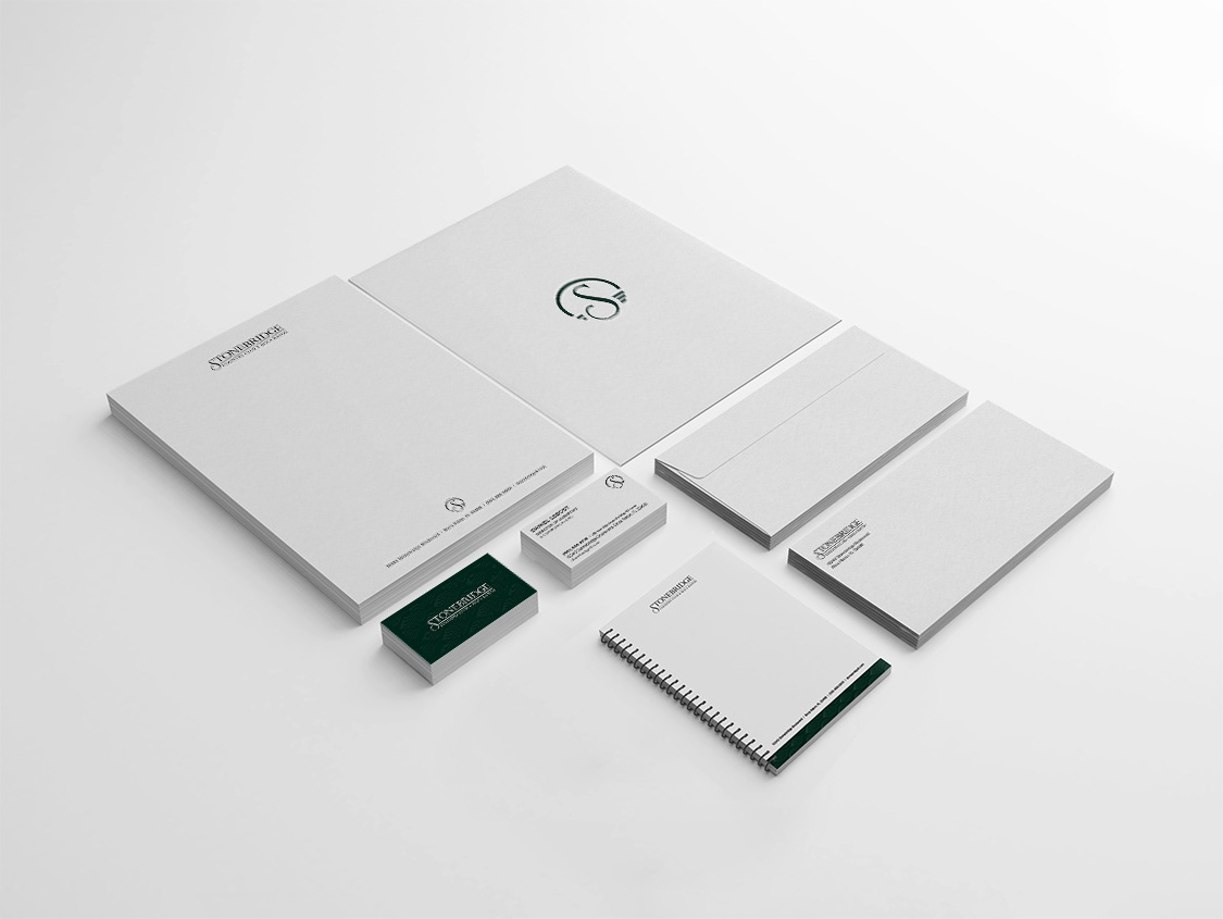
Branding and Stationery
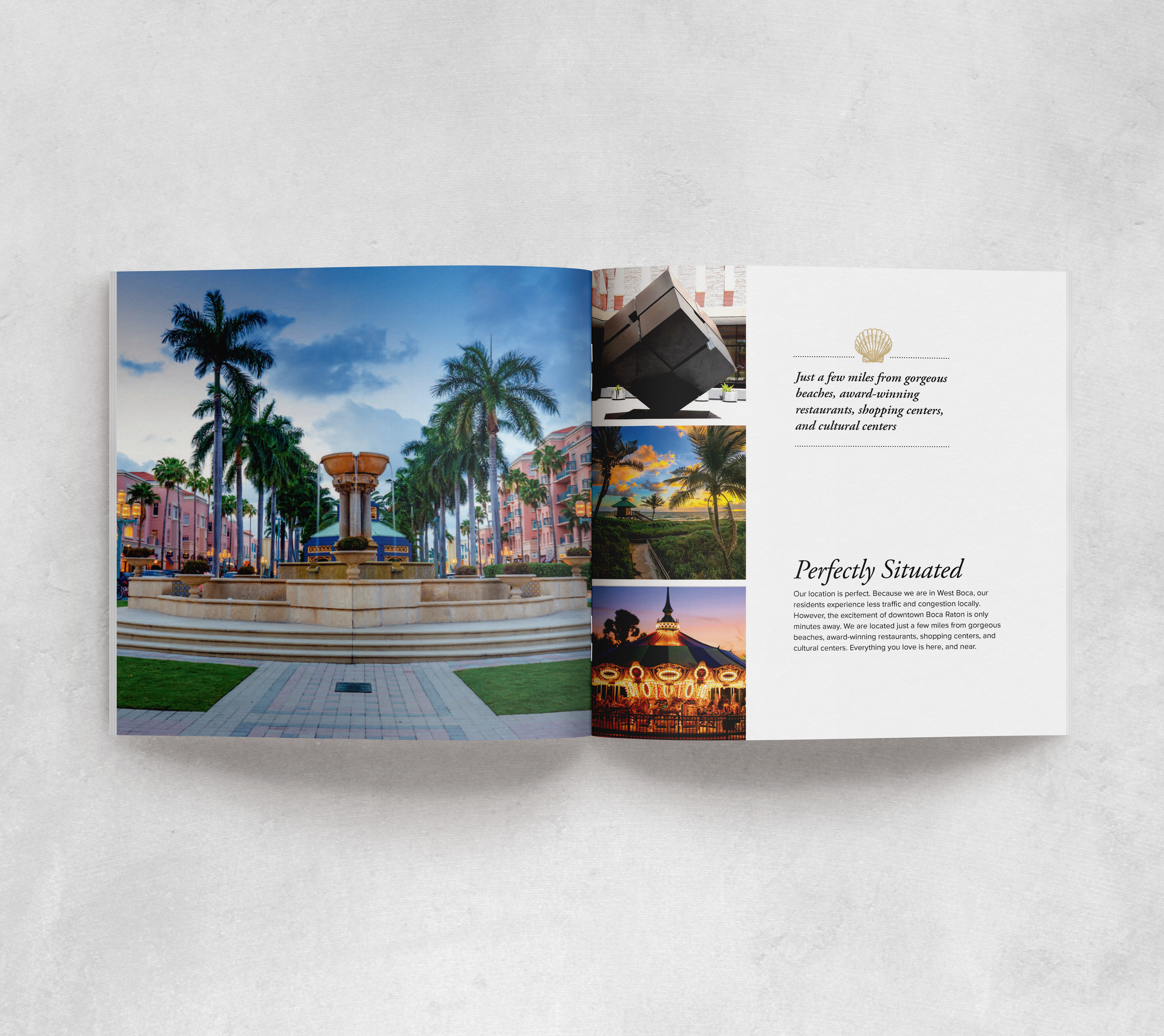
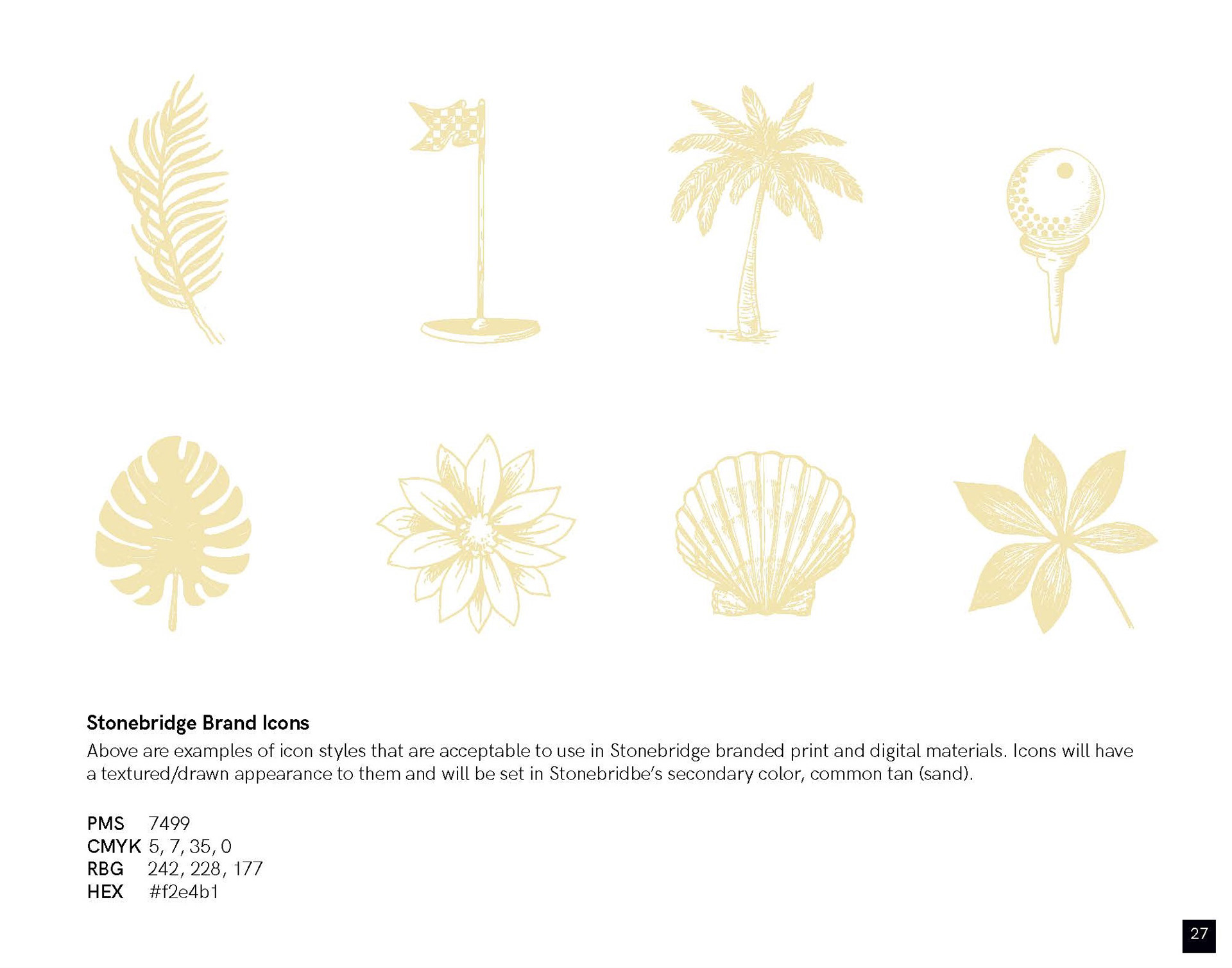
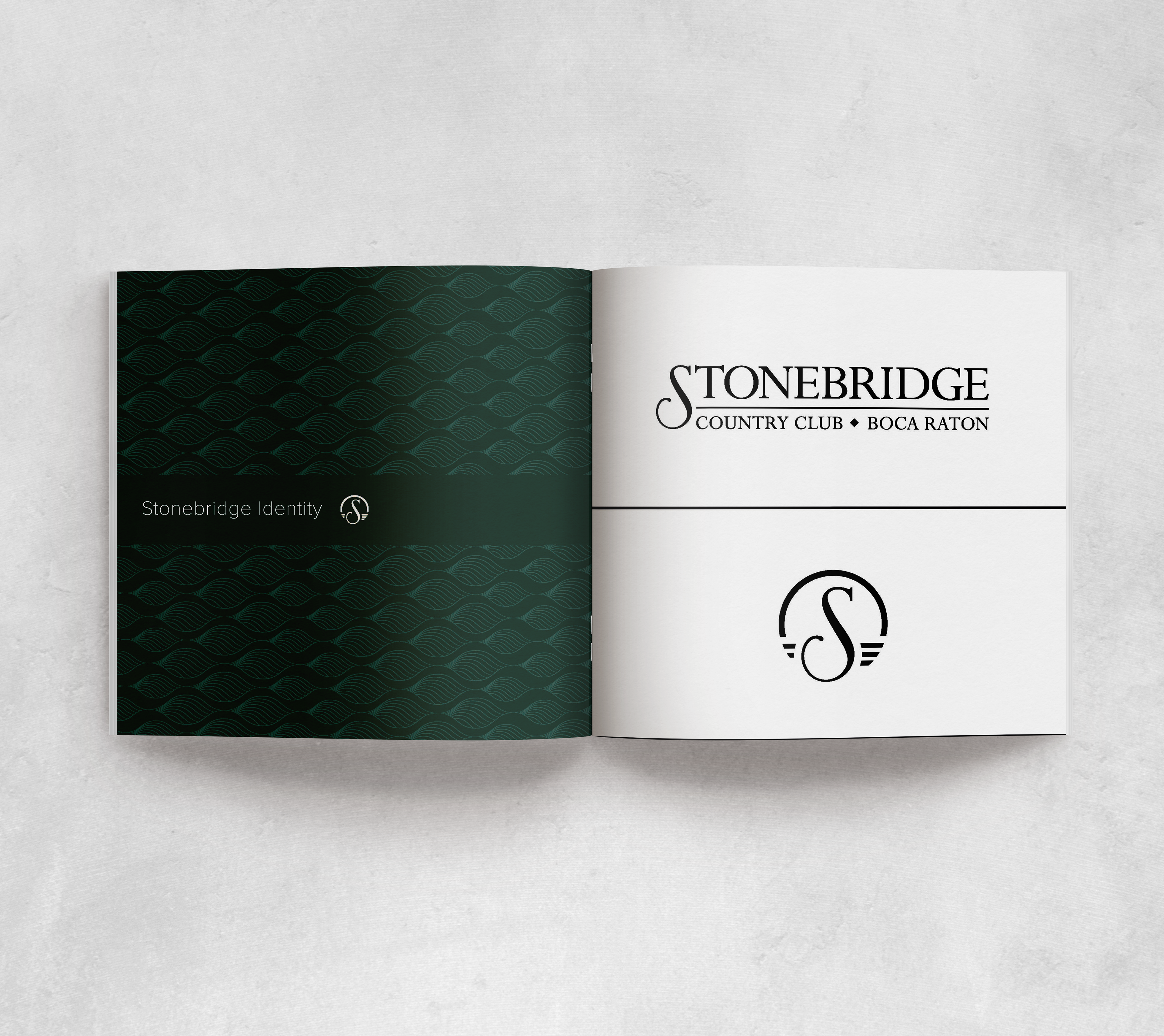
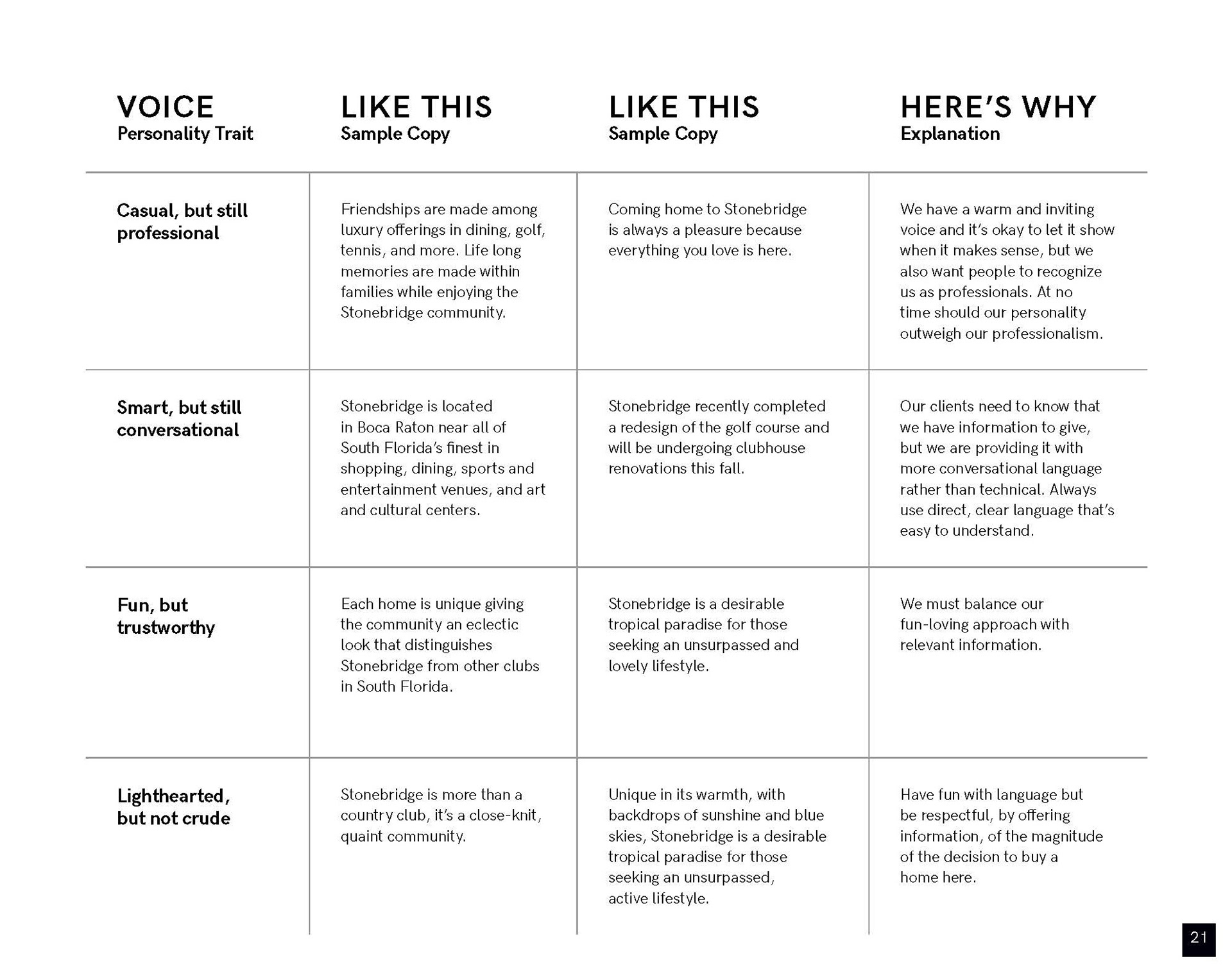
Branding from two country clubs I have worked at, most recently Royal Palm Yacht and Country Club and previously Stonebridge Country Club.
↑
Back to Top